Client
Hornig Capital Partners
Location
Mayfield Heights, OH
Type
Retail Center, Branding
Golden Gate Plaza
Creating a unique shopping center identity.
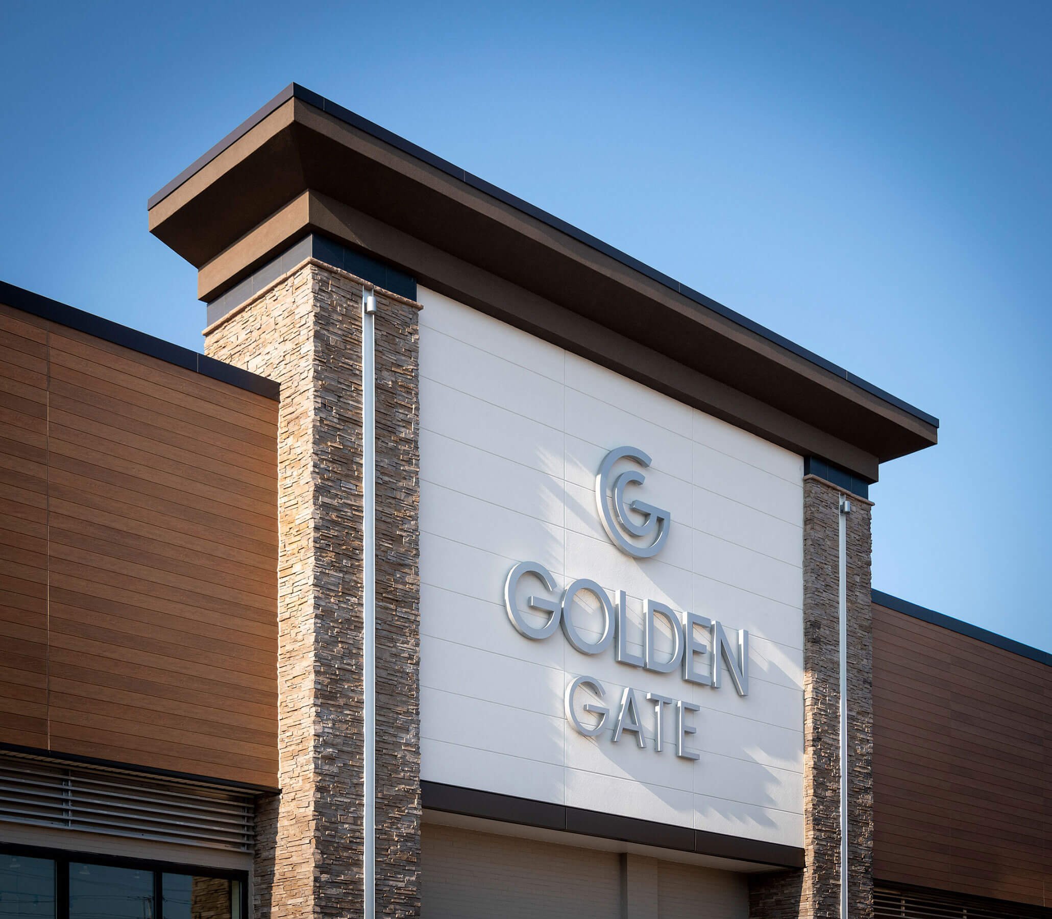
Golden Gate Plaza in Mayfield Heights, Ohio is an example of a strip mall renovation that expresses hybridization, with authenticity and articulation as the driving idea behind the contemporary remodel of the shopping center. As part of the renovation, Onyx Creative also created a unique brand identity for Golden Gate with logo design, typography selection, and signage design. The renovation and rebranding speak to today’s culture. Simple forms, attention to signage, and an emphasis on interesting and rich materials ensure a contemporary look that will positively impact its community and will be relevant for another generation.
This project took home the award for Retail Exterior Renovation Project of the Year at the NAIOP Northern Ohio Chapter Awards in May 2019.

Golden Gate is a 371,000 square-foot shopping center located at the intersection of Mayfield Road and Interstate 271 on Cleveland’s East Side. Built in the 1960s as a regional inline shopping center, it was designed as a U-shaped plaza with parking in the middle. The center was renovated in the 1990s in the postmodern style, incorporating a motif of square medallions, chunky canopies, and loud colors. Almost thirty years later, the center was ready for a transformation that would express today’s values for a more authentic architectural expression and a pedestrian-friendly experience. It follows a few simple rules to ensure a contemporary look that will impact its community and be relevant for another generation. The five million dollar capital improvement plan included improving the outdated façade with a newer, more contemporary storefront design and the implementation of a pedestrian-friendly landscape plan.
In the 1990s post-modernization of strip malls promoted kitschy aesthetics and architectural clichés. Replicas of traditional motifs such as pediments, cornices, and mansard roofs were deployed to bring articulation back to sterile architecture. This approach, while being a valid critique of the original strip mall, is now seen as disingenuous and lacks authenticity. The combination of these ideas, authenticity and articulation, is the driving idea behind the contemporary remodel of Golden Gate.
While the postmodern renovation of the strip center overemphasized the functional importance of the sign band, an articulated center should not restrict flexibility. Therefore, multiple thin layers were added to create depth and allow for a clean color change in the façade. In addition to this, an additional layer was strategically added that consisted of an aluminum grid pattern in an aluminum frame. The frame stands off the sign band to allow signs to slip over complex intersections within the façade. In natural places where the signs could fit comfortably, this aluminum grid was not used. However, where things got architecturally complicated, the aluminum grid was used to straddle multiple layers within the façade. While solving the problem of sign attachment at difficult junctures, the aluminum grid also created another layer of texture in the visual language. This added a dimension and depth to the project while solving a functional problem of universal sign placement.

Key architectural elements were the authenticity of volume, mass, and planes. A lively theme was created throughout the center by breaking the sign band at natural points in the façade. Two overlapping planes ran throughout the center and were disrupted by periodic entrance features that were considered simple, primitive masses. The interplay between planes and masses created enough interest in the visual field that it didn’t need to rely on historical ideas. Nichiha fiber cement panels were chosen with Environmental Stoneworks simulated stone to bring a rich and sophisticated look to the center. Planters and landscaping elements are strategically placed to add some greenery near the tenant storefronts.
This renovation breathed life back into a shopping center that has been around since the 1960s. The update has positively impacted the neighborhood by attracting a diverse range of tenants and a new restaurant.


There was also a unique brand identity created for the shopping center. Branding and signage services included working with the client to create a new logo design and signage design options. The new brand was then implemented on the building façade, front, and rear monument signs and tenant blade signs throughout the center.


